The Promise Of Spring

The Promise of Spring tc1The Promise of Spring tc2

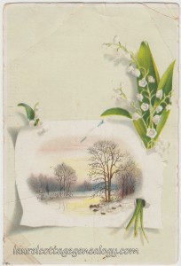
Trade card, circa 1898 – 1908.   Size:  About 3 and 3/8 x 5″  Condition:  Poor with folds, tape and some staining.

Price:  $4.00

Since we were in Detroit for the last two posts, this one had to be next for the following two reasons:  Lilies of the valley always remind me of my hometown; we had them in the backyard when I was growing up. And we just passed the month of April, and April in the D is often subjected to that one last snow or ice storm. Ha, yep, was it a week or two ago when the Tigers were playing in 38 degrees and snow flurries? So, I’m not lying! But what a beautifully designed trade card for the W. M. Hoyt Company. There’s a small lake in winter, with the dawn reflecting yellow off the water, the trees showing bare and the ground still covered with snow. But inserted through the side of this tableau is a promise of spring:  a small offering of lilies of the valley with their leaves, and a small sprig and leaf showing from underneath on the opposite side. If you didn’t notice right away, look again and you’ll see the pin drawn in at the top of the “paper.”  And one thing that we’re getting used to noticing (but is always wonderful) is how the shadows are carefully drawn or painted in. The back shows, in part:

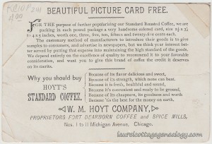
“W. M. Hoyt Company, Proprietors Fort Dearborn Coffee and Spice Mills, Nos. 1 to 11 Michigan Avenue, Chicago.”

“Why you should buy Hoyt’s Standard Coffee.”

“Because of its flavor delicious and sweet,

Because of its strength, which none can beat.

Because it is fresh, healthful and sound,

Because of its cheapness, its goodness and worth

Because ’tis the best for the money on earth.”

W. M. Hoyt Co. with an address of 1 Michigan Ave in Chicago, shows up on the 1908 commercial city directory, under the heading of Grocers – wholesale.

But the 1898 city directory reveals more information:  The W. M. Hoyt Co. was William M. Hoyt, president; Robert J. Bennett, vice-president; Arthur G. Bennett, secretary and treasurer; Albert C. Buttolph and Graeme Stewart directors. Address 1 – 11 Michigan Ave, and 1 – 9 River Ave.

Sources:  The Chicago Association of Commerce’s Membership Directory, June 1908, p. 115. (Ancestry.com. U.S. City Directories, 1821-1989.)

The Lakeside Annual Directory of the City of Chicago, 1898, p. 873. (Ancestry.com. U.S. City Directories, 1821-1989.)

Brunsing, Tolle & Postel Oak Run Whiskey

Brunsing Tolle and Postel tc1Brunsing Tolle and Postel tc2

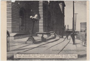
Liquor dealer advertisement for Oak Run Whiskey, San Francisco, CA, street scene, 1906, after the earthquake.

Price:  $8.00          Size:  5 x 3 and 3/4″

Here’s an old trade card, of sorts, showing a photo of a street scene described as:

“62.  View showing sink in the street near the new Post Office, San Francisco, Cal., after the earthquake of April 18,  06.”

This is on thin paper, produced from a photo that may have originally appeared in a newspaper or magazine. These types of reproductions were typically not high quality, were sometimes color-tinted, and even sometimes altered somewhat for content. Views of the aftermath of natural disasters were commonly made into postcards, and into advertisements that local businesses could give out, like the one we have here. Stamped on the back is:

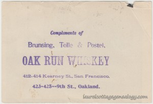
“Compliments of Brunsing, Tolle & Postel, OAK RUN WHISKEY, 412-414 Kearney St., San Francisco. 423-425 — 9th St., Oakland.”

Brunsing, Tolle & Postel, wholesale liquor dealers, from the 1907 city directory were:   Peter T. Brunsing (president) Oscar A. Tolle (vice-president) and C. D. Postel (treasurer, Alameda). C. D. Postel is likely Christian D. Postel (wines) from the 1906 Oakland city directory (Alameda County) which shows S. F., (so, cross-referenced, on the S.F. and Oakland directories.) The 1907 S. F. directory also shows D. J. Greger (secretary).

Unfortunately for the company, it was evidently forced to file bankruptcy in or prior to April 1909. But on a happier note, examples of old bottles and labels for B, T & P and their whiskey brand of Oak Run were currently found online, at the time of this post.

Sources:  Crocker – Langley San Francisco City Directory, 1907. pp. 328, 1300, 1582. Ancestry.com. U.S. City Directories, 1821-1989.

Husted’s Oakland, Alameda & Berkeley Directory, 1906. p. 589. Ancestry.com. U.S. City Directories, 1821-1989.

American Bankruptcy Reports, Vol. 22, ed. John T. Cook. Albany, New York:  Matthew Bender & Co.,1910, p. 129. (Google eBook.)

Launtz Millinery, Salinas, CA

Launtz Millinery tc1

Antique trade card, circa 1890 – 1891.     Size:  About 2 and 5/8 x 4 and 1/2″

Price:  $15.00

This trade card is the first in a new category that we’re labeling “Breakthroughs”  (for lack of a better term.) I’ve asked around at ephemera trade shows and antique stores, but so far, no one recognizes this type as belonging under a certain title. They show variations on people and animals “breaking through” the envelope or paper – sort of a “here I am, coming to you in the mail” type of thing. They seem to have been quite popular, and can be seen on trade cards like this one, and on old postcards or cards in general. We have a number of them here at Laurel Cottage that we’ll be posting. On a similar note, check out an earlier offering entitled, “Into The Envelope” that has rather a “pre-breakthrough” theme, and another related one, “A Token Of Love.”

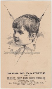
Anyway, this one shows a charming drawing of a little girl’s face, in semi-profile, advertising Mrs. Launtz’s millinery:

“Mrs. M. Launtz. Dealer in Millinery, Fancy Goods, Ladies’ Furnishing Goods, Etc. Cor. Main and Alsal Sts., under Pacific Hall, Salinas City, Cal.”

That’s the corner of Main and Alisal. The San Jose (includes Monterey County) city directory for 1890 – 1891 shows this proprietress as living at this same address. M. Launtz was not found in other online records, though likely she would have been found on the 1890 Federal Census if most of that had not been destroyed by fire in 1921. But what was Pacific Hall? I took a trip down to Old Town and inquired with the very knowledgeable Trish, at Destination Salinas. I found out that whichever building that had housed Mrs. M’s millinery in 1890 and ’91, no longer exists. (Damaged in the 1906 San Francisco earthquake? This is just speculation.) But per Trish, early Salinas fraternal organizations had dance halls, and these halls were located on the second, rather than ground, floor. So, one possibility is that Pacific Hall was one such fraternal upstairs dance hall, with Mrs. M. Launtz’s millinery located just below.

More from the 1890 – 1891 city directory

Going page by page through the same 1890 – ’91 city directory lent a little more info:  Mrs. M. Launtz had two single ladies working for her as milliners – Miss Emma Benjamin and Miss Emma Gibson, address given as corner of Main and Alisal (however it is unclear whether this was the girls’ residence also, or just M. Launtz’s.)

An entry under “Baptist Church” gave the address as corner of Main and Alisal.

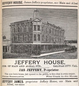
The Jeffery House, illustrated below, showed up for various residents as both a business and residence address. One would think that if Mrs. M. and the others at Main and Alisal were located at the Jefferey House, that the listings would be stated as such. So, it would seem like the millinery was not in this building, but of course, we can’t be sure.

Jeffery House

One more very interesting tidbit from the directory was listed under “Agricultural Hall” corner of Main and Alisal. Hmmm, Pacific Hall and Agricultural Hall…intriguing!

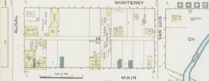
UPDATE:  Per an informed reader (thanks, Joe!) the Launtz millinery (today’s address 301 Main St. in the Bank Building) shows up on a wonderful map, dated August 1886, entitled the Sanborn Fire Insurance Map, online at Library of Congress. Excerpt below, page 6 of 8. Millinery is abbreviated “Milly” (bottom left). The Sanborn Abbreviation Glossary has a full list of interesting (and logical for fire insurance) entries, such as B.C. for brick chimney, S.P. for stove pipe and Shooks meaning dismantled wooden box parts.

Sources:  San Jose City Directory, Including Santa Clara, Santa Cruz and Monterey Counties, 1890-1891. pp. 760-761, 769, 773-774, 776. Publisher:  F. M. Husted, San Francisco. Web accessed April 4, 2015. (Ancestry.com. U.S. City Directories, 1821-1989)

Sullivan, Trish. Per web author’s visit to Destination Salinas, 222 Main St., Salinas, CA. April 4, 2015.

Jeffery House/Salinas. TC-303489; K-62. Token Catalog. Web accessed April 5, 2015.

Image 6 of Sanborn Fire Insurance Map, August 1886. www.loc.gov. Accessed January 8, 2022.

Glossary of Abbreviations and Obscure Terminology in Sanborn Fire Insurance Atlases. Compiled by California State University, Northridge (CSUN) Map Library. library.duke.edu. Accessed January 8, 2022.

Lewando’s French Dye House

Lewandos French Dye House tc1

Trade card. Circa 1877 – 1881.    Size:  About 5 and 1/4 x 2 and 3/4″

Price:  $25.00

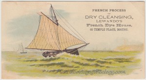
“French Process of Dry Cleaning, Lewando’s French Dye House, 65 Temple Place, Boston.”

Here’s a beauty: a trade card showing a sailboat prominent in the foreground, with some others in the background, and a bare suggestion of a lighthouse atop some hills protecting the harbor. The light green color of the ocean is a little unusual, and I think, part of what makes this card so nice.

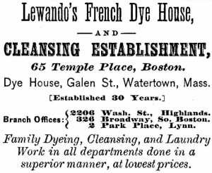
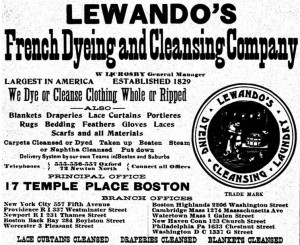
City directories were found from 1877 – 1880 for 65 Temple Place address. By at least 1882 Lewando’s was at 17 Temple Place. Below is the 1877 ad showing they had been in business for the past 30 years, but a conflicting date shows up online at Historic New England for an undated trade card which shows  “Established 1829.”  In any case, Lewando’s was very successful and city directory ads show up into at least the 1960’s, as well as a current location in Needham, MA under the name of Lewando’s (not sure if the more recent ones were a continuation of the original business; they may or may not have been, but that would require more research which we won’t get into here.)

Lewandos 1877 Ad

1877 ad showing the 65 Temple Place address.

Lewandos 1906 Ad

1906 ad showing the 17 Temple Place address as well as eleven other locations.

Well, we could veer off in many directions in researching this trade card. What was the “French dye process”? After searching online briefly, I still don’t know but did find out that the word “denim” is of French origin….Did you know that ancient Romans used a dry cleaning method – of urine (for the ammonia), lye and fuller’s clay? Here’s a great article on the history of dry cleaning highlighting two men, Thomas Jennings, the first African American to receive a U.S. patent (1821 for his method of dry cleaning he called “dry scouring”) and Frenchman Jean-Baptiste Jolly, sometimes called the father of modern dry cleaning. Check out green alternatives to modern dry-cleaning though, if you haven’t done so already.

UPDATE:  Do also check out this link re Lewando’s and playing cards from the comment below and the website, Amused by Jokers am I!

Sources:  Boston City directory, p. 1302.  The New-England Business Directory, 1877.  Ancestry.com. U.S. City Directories, 1821-1989

The Boston Directory, No. LXXVI. 1880. p.1254. Ancestry.com. U.S. City Directories, 1821-1989.

The Boston Directory, No. LXXVII. 1882. p.1471. Ancestry.com. U.S. City Directories, 1821-1989.

Sampson & Murdock Co. Boston Directory. 1906. p. 2816. Ancestry.com. U.S. City Directories, 1821-1989

Stone, Sarah, “How Dry Cleaning Works And Who Invented It.”  Today I Found Out. Web accessed March 28, 2015. [http://www.todayifoundout.com/index.php/2014/09/history-dry-cleaning/]

Green “Dry” Cleaning. September/October 2007. Green America. Web accessed March 28, 2015. [http://www.greenamerica.org/livinggreen/drycleaning.cfm]

The Cozy Corner Bar, Havana Cuba

The Cozy Corner Bar tc1

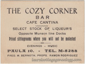
The address and telephone number printed above were the keys to finding the location of The Cozy Corner Bar, Cafe Cantina. The proprietors are listed as Fred. M. Bernoth and Ramon Rodriguez, and they were offering a “select stock of liqueurs”  “private sitting rooms where you will not be molested” and music in the evenings. They were located at 10 Paula, opposite the Munson Line docks, in Havana, Cuba. This address with the same phone number (M-5288) was at one time under the name of Maggie’s Bar and Jiggs Cafe, according to a Worthpoint article from an online seller (item was sold in 2009) describing a trade card from his or her grandfather’s memorabilia. Said trade card was estimated to be from about 1933, and the author explained,  “Maggie’s Bar and Jiggs Cafe was a club and eatery operated by Pat Cody, an Irish transplant from New York City, who during the US Prohibition-era moved his popular NYC saloon, Jigg’s Uptown Bar, and relocated to Havana, Cuba.”  Like the Cozy Corner card, Cody’s ad also had some misspellings, but more importantly showed  “Select Stock of Liqueur’s”  with that same punctuation error, and that they had music in the evenings. It seems likely then that The Cozy Corner became Maggie’s/Jiggs or vice versa.

7,000 Bars

Click the above for a fascinating article from Difford’s Guide for Discerning Drinkers, which highlights the effect that U.S. Prohibition had on club owners in the States:  “Estimates suggest there were some 7,000 bars in 1920s Havana”,   and informs that even before the Prohibition Amendment Havana was considered to be the “Paris of the Caribbean.”

Trade card from Havana, Cuba. Circa 1920s – 1930s.

Condition:  slight creasing at the top left corner and right side, and a crease at the bottom left corner.

Price:  $30.00     Size:  About 3 and 7/8 x 3″

Sources:  Jiggs Cafe/Maggie’s Bar Havana Cuba 1933 card Jigg’s. Worthpoint. Web accessed March 21, 2015. [http://www.worthpoint.com/worthopedia/jiggs-cafe-maggies-bar-havana-cuba-53156670]

7,000 bars in Havana:  When American bartenders invaded Cuba. Difford’s Guide. July 31, 2013. Web accessed March 21, 2015. [http://www.diffordsguide.com/magazine/2013-07-30/4/america-invades-cuba]

The Village Belle

The Village Belle tc1The Village Belle tc2

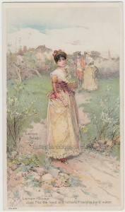
Trade card, circa 1887. Lithograph by G.H. Buek & Co., New York. Based on an original watercolor by Edward Percy Moran.

Price:  $20.00      Size:  About 3 and 1/4 x 5 and 1/2″

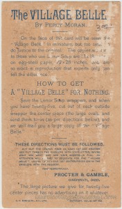
How nice that the copyright date is given on this stunning trade card. It shows 1887 by Art Age, and is a lithograph produced by G. H. Buek & Co., New York. This makes this piece of ephemera, as of the time of this post, about 128 years old. The back shows the company Procter & Gamble promoting it’s product Lenox Soap with the description,  “Just Fits the hand and lathers freely in hard water.”  (There’s that incongruous use of a capital letter that we see so often!)

Edward Percy Moran (1862 – 1935)

Edward Percy Moran was a prominent American artist who is well-known especially for his scenes of Colonial America. Born in Philadelphia into an artistic family, his father Edward Moran was a notable English-born artist who had emigrated to the United States; his brother Leon, two uncles, Peter and Thomas, and a cousin, Jean Leon Gerome Ferris were also noted for their artistic talents. Edward Percy Moran studied under his father, and also at the Pennsylvania Academy of Fine Arts, the National Academy of Design, and in London and Paris. He died in New York City in 1935, and his works are maintained in at least several collections in museums around the country.

25 center pieces…

To get a large print without advertising back in the day, you had to cut out twenty-five center pieces of the outside wrappers and send them in to Procter & Gamble. I like the advertiser’s sense of humor here in the header  “How to get a ‘Village Belle’ for nothing.”
And it is important to note that G.H. Buek & Co. and/or P&G  were stressing that the trade card was unable to do justice to the larger print that was being offered. (The biggest difference we note is that the lack of detail in The Belle’s face on the trade card gives her a different expression – but charming nonetheless.)

A Facsimile…

The original “Village Belle” was done in watercolor; prints of the original can still be found at auction from time to time. An excerpt from The American, Vol. XV, published in 1888, on the subject of the reproduction process and citing “The Village Belle” as an example, is as follows:

“It is a pity that ‘chromo’ has come to have so ignoble a meaning; for the art of chromo-lithography is capable of so excellent a use and so fine results that it deserves to be held in respect. When we divest ourselves of prejudice, we perceive the merits of many colored ‘prints’ in the shop windows, and any candid artist will admit to us that the lithograph worker has been able to produce in them results which can scarcely be distinguished, – and for all practical purposes of eye delight, do not need to be distinguished, – from the original work of the artist himself. An example of this is the reproduction, by the Art Age, of New York, of a water color by Percy Moran, ‘The Village Belle.’ In this every tint and effect of the original is brought out, the colors are as fresh and delicately expressed as they were by the artist’s brush. It is, in fact, a fac-simile, and required no less than eighteen distinct printings, the number of colors and combinations of coloring thus produced being between twenty and thirty. It is a charming picture, and there is no reason, except the fact that you can buy it for a dollar, why it should not go on your walls with the others of like rank in the scale of the beautiful.”

The Belle helps to sell Want Ads….

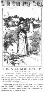
As promised (I’d forgotten till the comments from Elle reminded me – thanks, Elle!) here is the newspaper article that appeared in the San Francisco Chronicle, May 2, 1896. Expression-wise, it doesn’t do The Belle justice, but still, one would think it turned out pretty good, picking up so much detail. What would have been involved in printing something like this back then?

Sources:  Edward Percy Moran. n.d. http://en.wikipedia.org/wiki/Edward_Percy_Moran. (accessed March 15, 2015).

Thompson, Robert Ellis (Ed.) (1888) The American. Journal of Literature, Science, the Arts, and Public Affairs., Vol. XV. p. 43. Web accessed March 15, 2015.

Edward Percy Moran (1862 – 1935). White Mountain Art. Web accessed March 15, 2015.

“To Be Given Away To-day.” San Francisco Chronicle, May 2, 1896, Saturday, p. 12. (Newspapers.com).

A. C. Skinner, Lowell, Mass.

A C Skinner Lowell Mass tc1

Business and advertising card. Circa 1872 – 1891

Price:  $12.00           Size:  3 and 7/8″ x 2 and 1/8″

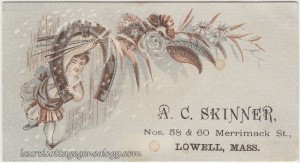
This is either a trade card or calling card or maybe a combination of both. A. C. Skinner ran a “fancy goods” store at the address given on this card:  Numbers 58 & 60 Merrimack St. in Lowell, Massachusetts. And the card shows a beautiful little design of a petite lady or elf, holding a few branches with various flowers and leaves; because of the copper and light blue-gray colors of the card they almost appear to be a dried flower arrangement. It’s sort of an awkward pose for the little elf, holding onto a horseshoe (which hangs from a nail) with one arm, and with the other outstretched above her head to display the flowers, and it’s snowing. A somewhat unexpected illustration and ever so charming.

Exactly who A. C. Skinner was was not found in online records, but a huge amount of time was not spent searching. There is a Methodist pastor under this name in Lowell, at Saint Paul’s church in 1916, but one wouldn’t want to assume that they are one in the same. In any case, numerous city directory entries were found for A. C. Skinner showing from at least 1866 through 1870 that his store was located at 63 Merrimack St. and was advertised as “Laces, Embroideries & Dress Trimmings.”  1872 through as late as 1891 he was located at 58 & 60 Merrimack St., and was advertised as  “Fancy Goods.”

The long-time Lowell department store Bon Marché which operated from 1878 – 1976, had an early connection with A. C. Skinner. Bon Marché’s founder, Frederick Mitchell, once worked for A. C. Skinner.

Sources:  Ancestry.com. U.S. City Directories, 1821-1989. Various Lowell, Massachusetts city directories, 1866 – 1891.

“Remembering Downtown Lowell’s Bon Marché through the Years, 1878-1976.” Forgotten New England, March 6, 2012. Web accessed February 1, 2015.

Landseer Cards By Shober & Carqueville

Landseer c1Landseer c2Landseer c4


Landseer c3Landseer c5


Landseer c6

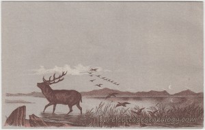
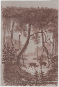
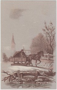
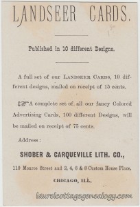
Trade cards, set of five. Circa 1885 – 1894. Shober & Carqueville Lithograph Co., Chicago Illinois.

Price for the set:  $15.00     Size:  About 2 and 3/4 x 4 and 1/4″

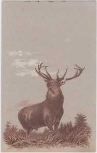
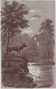
A set of five advertising cards put out by the Shober & Carqueville Lithograph Company of Chicago, showcasing at least one lithograph based on the artwork of London-born Sir Edwin Landseer (1802 – 1873.) Per a Wiki entry, there were fourteen Landseer children, seven of whom survived to adulthood, and all seven became artists. Edwin’s older brother Thomas (1793 or ’94 -1880) is known for having done engravings and etchings of Edwin’s work. The last image shown here, that of the man driving the horse-drawn sled, does not have any printing on the back, but all the others show the same identification as the image directly above. The top left of the majestic stag is easily verified as being from the famous oil painting by Edwin Landseer, which was done in 1851 and is called The Monarch of the Glen. (Yes, I know there was a British t.v. series, too, by this name!) If you’ve clicked on the link, you’ve found that this painting (not to mention the artist’s themselves) has had a rather fascinating story to tell. You’ll also immediately notice that the mountains and clouds in the original are missing from the trade card displayed here.

The Shober & Carqueville Lithograph Company was formed from the association of Charles Shober and Edward Carqueville. According to biographical info in volume 4 of Industrial Chicago, Carqueville was born in Posen, Prussia in 1841, coming to Chicago in 1857. He began working for Keen & Shober, where he learned the art of lithography. In 1865 he formed the Chicago Lithograph Company which operated till it was destroyed by the Great Fire of 1871. Afterwords the Charles Shober & Company was formed, with Carqueville as a partner. This name later changed to the Shober Lithograph Company, and then to the Shober & Carqueville Lithograph Company. The latter name was supposedly in place by at least 1894, when it was mentioned as the “current” name for said company in the aforementioned Industrial Chicago publication, but we see this company name as early as 1885 per Chicago city directories. From online records we see that Edward Carqueville had a number of sons to carry on the business and it appears (from the city directories again) that the company was being passed down around 1896 or so, with the 1896 directory for Edward showing the business name of Carqueville Lithograph Company, and evidence of one or more of his sons appearing in business with him. Edward Carqueville died in March of 1898.

Sources:  The Monarch of the Glen. n.d. http://en.wikipedia.org/wiki/The_Monarch_of_the_Glen_%28painting%29 (accessed January 15, 2015).

Edwin Henry Landseer. n.d. http://en.wikipedia.org/wiki/Edwin_Henry_Landseer (accessed January 15, 2015).

Thomas Landseer. n.d. http://en.wikipedia.org/wiki/Thomas_Landseer (accessed January 15, 2015).

Industrial Chicago: The Commercial Interests, Vol. 4. Chicago:  The Goodspeed Publishing Company, 1894. p. 487. (Google eBook)

Edward Carqueville. Find A Grave Memorial# 119060120. (Findagrave.com)

The Lakeside Annual Directory of the City of Chicago,1885. Chicago:  The Chicago Directory Co. p. 292. Ancestry.com. U.S. City Directories, 1821-1989.

The Lakeside Annual Directory of the City of Chicago,1896. Chicago:  The Chicago Directory Co. p. 385. Ancestry.com. U.S. City Directories, 1821-1989

J. E. Allen & Sons Trade Card

J E Allen & Sons tc1J E Allen & Sons tc2

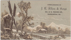
“Compliments of J. E. Allen & Sons. No. 16 N. Third St., Harrisburg, PA.”

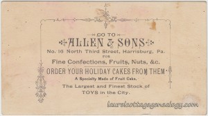
Here’s a beautiful trade card for the winter season:  a country scene in brown and white on gray; showing a man driving a two-horse drawn sled which is hauling some very large logs. They are driving past a large windmill, appearing on their left. The road is bordered by a rustic wooden fence, and there are some trees and buildings in the background; note the church steeple. The back of the card has a beautifully delicate design, which is a partial border around the message:

“Go to ALLEN & SONS. No. 16 North Third Street, Harrisburg, Pa. For Fine Confections, Fruits, Nuts, &c. ORDER YOUR HOLIDAY CAKES FROM THEM. A Specialty Made of Fruit Cake. The Largest and Finest Stock of TOYS in the City.”

Imagine being able to go back in time to this store, especially just before Christmas!

J.E. Allen & Sons was John E. Allen, and sons James C. and George. The 1880 Federal Census for Harrisburg shows:  John E. Allen, born about 1825; his wife Frances E., born about 1834; son’s George, born about 1856; James C., born about 1858; daughter Mary E., born about 1862; son Charles E., born about 1865; and Rosanna Paul, occupation servant, born about 1827. All in the household are Pennsylvania natives except for Frances, who is native to New York. Occupations for John E. Allen and sons George and James C. are listed as baker. City directories found online for this company are running from 1876 – 1882.

Trade card, circa 1876 – 1882.   Size:  4 and 1/2 x 2 and 1/2″

Price:  $15.00

Sources: Boyd’s Harrisburg City Directory, 1876 – 1877. p. 81. (Ancestry.com. U.S. City Directories, 1821-1989)

Boyd’s Harrisburg “Telegraph” Directory, 1882 – 1884. p. 343. (Ancestry.com. U.S. City Directories, 1821-1989)

Year: 1880; Census Place: Harrisburg, Dauphin, Pennsylvania; Roll: 1123; Family History Film: 1255123; Page: 193A; Enumeration District: 087; Image: 0389 (Ancestry.com)

Mullen & Bluett Clothing Company

Mullen & Bluett Clothing Company pc1Mullen & Bluett Clothing Company pc2

Undivided back, artist-signed, unused postcard. Publisher:  American Commercial Advertising Company, New York. Circa 1909 – 1910.

Price:  $20.00

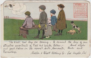
Here’s an old postcard that was used for advertising purposes by the Los Angeles, California-based Mullen & Bluett Clothing Company, and shows an illustration by Hamilton, Ontario-born artist Benjamin Sayre Cory Kilvert. The clothing company wrote:

“The chill, cool days are coming, to remind the boys of our attractive assortments of Fall and Winter Clothes – Good styles and good values in the newest Suits, Overcoats, Hats and Furnishings.  Mullen & Bluett Clothing Co – Los Angeles, Cal.”

Two similar postcards were found (at the time of this post) for sale on eBay. They show the exact same format – illustrations by the same artist, calendar in top right, postcard back with the same “Mailing Card” heading, same publisher and the exact same writing style for the message. One is a summer scene with the calendar for August 1910 for the H.M.& R. Shoe Company,Toledo, Ohio, and the other a winter scene with a January 1910 calendar for The Luke Horsfall Company. This was really quite clever of the publisher, American Commercial Advertising:  You have designs by a popular artist, a new possibility every month, a small calendar (always handy) included on the card, and a space for the clothing company, shoe company or whatever, to write a few short lines to their existing and potential customers.

A third postcard, and one made for Mullen & Bluett, like the one we have here, can be found on the excellent Plummer & Associates’ Blog. They also show some old postcards of the various Mullen & Bluett stores.

Lastly, the postcard back showing “Mailing Card” and “This Side for Address Only” does not seem to have been as common as those that say “Private Mailing Card.” Probably this one was printed either in late 1909 or early 1910, but the company must have been using old card stock, since on March 1, 1907 the U.S. postal regulations had changed to allow the divided back.

Source:  Plummer, John. “Downtown Los Angeles History.” Plummer & Associates’ Blog. February 6, 2011. Web accessed November 21, 2014.